Cayuse Design System
Taking a design system from rudimentary documentation to 60+ shared components in one year, resulting in improved consistency, efficiency, and developer productivity across multiple products and advanced accessibility to meet WCAG 2.1AA standards.

Role: Senior UX Designer
Team: Viktor Andreiev (Front-End Developer), Nick Brosas (UX Designer), Iryna Dubiak (Front-End Developer), Vladimir Fedorchenko (Front-End Developer), Caitlyn Holland (Senior UX Designer), Shankar Tiwari (Front-End Developer)
My Contribution: UX Design, Project Management
Team: Viktor Andreiev (Front-End Developer), Nick Brosas (UX Designer), Iryna Dubiak (Front-End Developer), Vladimir Fedorchenko (Front-End Developer), Caitlyn Holland (Senior UX Designer), Shankar Tiwari (Front-End Developer)
My Contribution: UX Design, Project Management
Employer: Cayuse
Skills: Project Management, UX Design, Accessibility
Tools: Figma, Confluence, Airtable
Timeline: 1 year
Skills: Project Management, UX Design, Accessibility
Tools: Figma, Confluence, Airtable
Timeline: 1 year
User Problem
Cayuse’s core business is aiding research administrators through the research lifecycle, a complex multi-step process that includes applying for a grant, budgeting, maintaining compliance, and sharing findings with the public. Cayuse had acquired a portfolio of products that addressed different phases of the lifecycle—products with fantastic functionality but very different designs. Because of these inconsistencies, using these products together as part of the research lifecycle led to a confusing user experience.Additionally, due to a company restructuring, instead of focusing on one product from the Cayuse suite, the two-person UX team was responsible for supporting all twelve (12) products. We could no longer work one-to-one, a single designer supporting a single product. We realized we needed to shift to a one-to-many approach to be as efficient as possible.
Cayuse’s various product logos.
Goal
Design and build a visually consistent, WCAG 2.1AA compliant, shareable library of components and patterns that incorporate best UX practices. This would serve as a foundation for current and future designs and could be used by anyone — product managers, designers, and developers — across all Cayuse products. The improved efficiency across products would save the company time and money.Process
- Gather a team
- Prioritize work
- Build Figma designs and Confluence documentation
- Work with developers to create interactive components
- Share components with other teams
Gather a team
2. Prioritize work
We used the recently completed product VPATs (Voluntary Product Accessibility Template) to determine which components used across our products had the biggest accessibility violations, giving top priority to those with high usage and high severity. That way we could improve the accessibility of our products while making them consistent. Since we have forms on almost every page, it was no surprise that the “Button” component was at the top of the list.
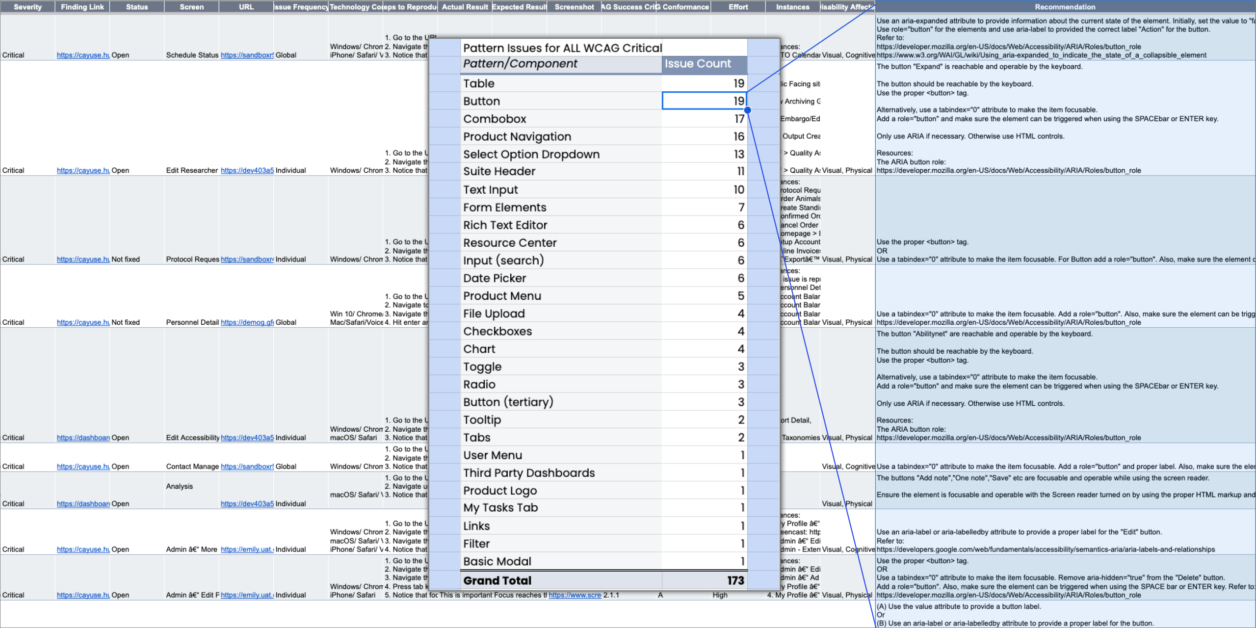
Spreadsheet of VPAT with a list of the components with WCAG Critical violations.
3. Build Figma designs and Confluence documentation
The UX team worked together to develop the pixel-perfect look and feel of each component and pattern in Figma. We built prototypes for the advanced patterns and responsive views. At the same time, we wrote Confluence documentation to explain the usage and behavior in words, down to each state and error message. We defined the UX acceptance criteria for functionality, providing a guide to QA or anyone with a question about how a component should work.
We frequently referenced W3C and Nielsen Norman Group for best practices to ensure we were giving users of all abilities the best possible experience.
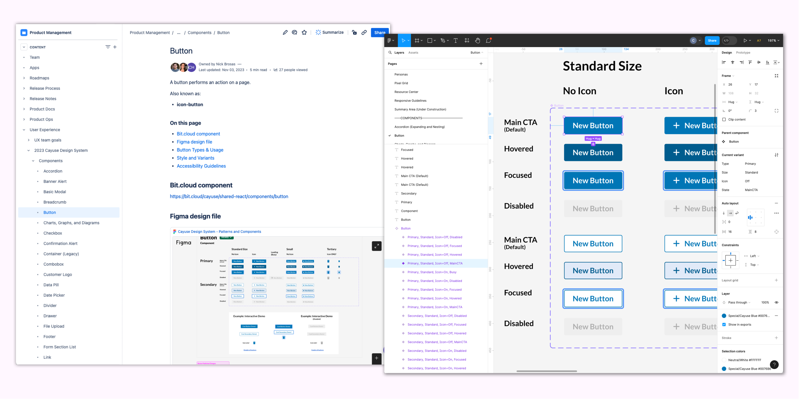
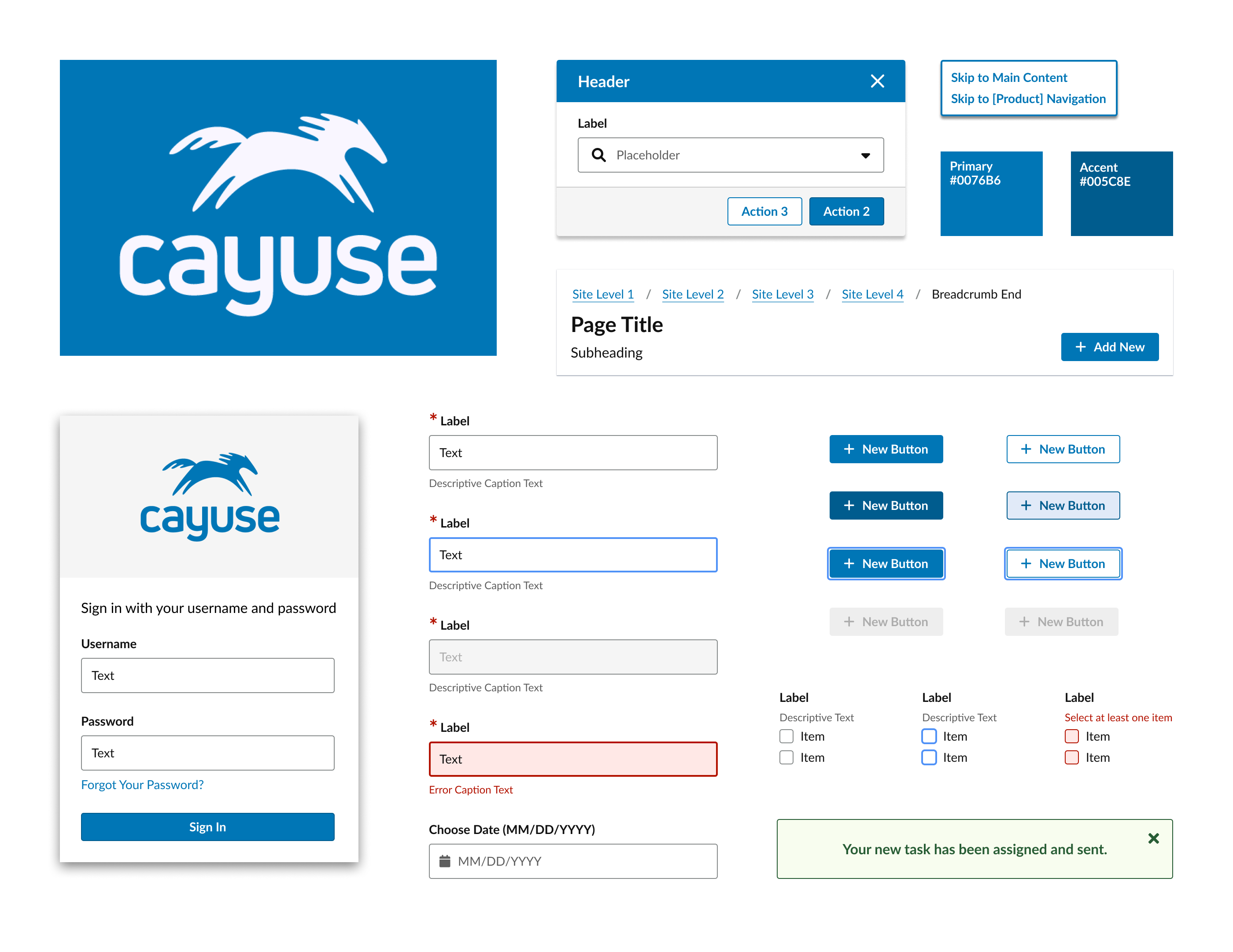
Confluence documentation and Figma designs for Button component.
4. Work with developers to create interactive components
Tech Guild developers used our Figma designs and Confluence documentation to build out interactive prototypes in bit.dev. The UX team would review the components and work with the devs to ensure that the prototypes were accessible and consistent with our initial designs. This collaborative process of refining each component and pattern resulted in designs and documentation that improved the experience and functionality for both sighted and non-sighted users.
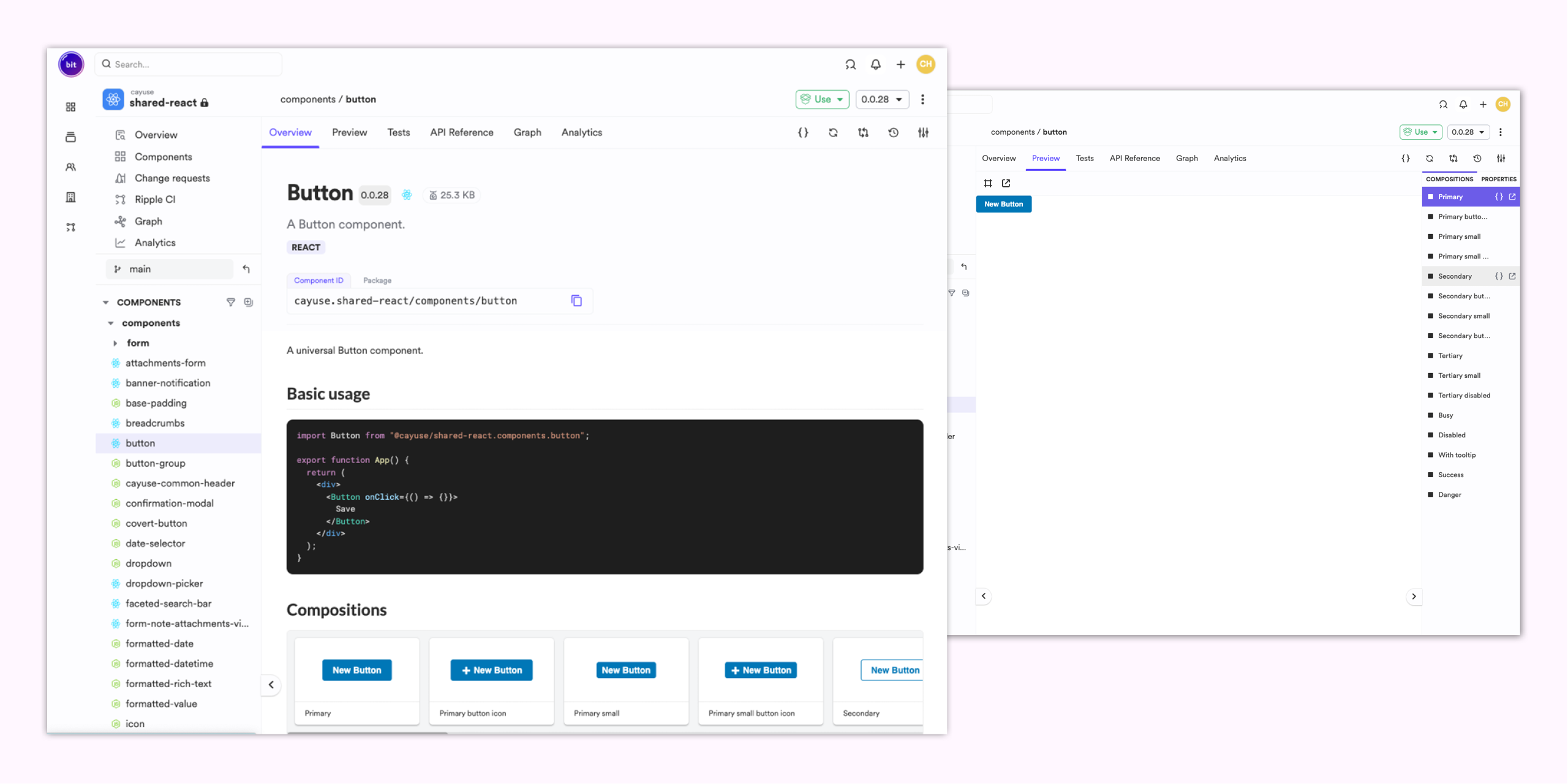
Button shared component with compositions in bit.dev.
5. Share components with other teams
Once we had a finished component in bit.dev, we shared it with other team lead developers to use in their products. While not all teams could use the code due to different tech stacks, all teams could reference the designs, documentation, and prototypes to understand the intended look, feel, and functionality.
Results
The time and effort we put into the shared library has resulted in improved efficiency and accessibility across products. After one year, the Tech Guild had created 60 shared components and patterns in bit.dev. Additionally, we built a core group of lead developers who realized the Design System’s value and became evangelists, actively advocating for its use.
Accessibility improvements Before and After

Before
Focus indicator does NOT have a 3:1 contrast ratio with adjacent colors.

After
Focus indicator DOES have a 3:1 contrast ratio with adjacent colors.
Focus indicator DOES have a 3:1 contrast ratio with adjacent colors.

Before
Type on the secondary button did NOT meet WCAG 2.0 AA contrast ratio of 4.5:1 with the background.
Type on the secondary button did NOT meet WCAG 2.0 AA contrast ratio of 4.5:1 with the background.

After
Type on the secondary button does meet WCAG 2.0 AA contrast ratio of 4.5:1 with the background.
Type on the secondary button does meet WCAG 2.0 AA contrast ratio of 4.5:1 with the background.

Before
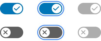
Green color was inconsistent with other interactive elements, and the words “Yes” and “No” required translation for international users.
After
Blue is consistent with our branding and other interactive elements and checkmark and “x” symbols do not require translation.
“One of Caitlyn's greatest strengths is her collaborative approach to projects. She excels at fostering a shared sense of purpose and building strong relationships with cross-functional teams. Her contributions have consistently elevated the quality of our products, leading to improved user satisfaction and NPS scores.”
— Ben Panning, CTO